

Data visualization
Make meaning visible.
Lesson 1:
Rigorous visualization for clarity and interpretation
Summary
This lesson introduces the dual role of data visualization in science as a tool for communication and discovery. It explores how well-designed visualizations clarify complex findings, while poor design choices (like misleading scales, unnecessary complexity, or inaccessible formats) can distort meaning and obscure the scientific message. Through examples, learners will see how visualization choices directly shape interpretation, and how rigorous practices promote clarity, transparency, and accessibility in research communication.
1.1 The role of data visualization in scientific communication
Data visualization is the bridge between complex data and human understanding. It translates numbers into forms that our eyes and brains can process rapidly, transforming tables of measurements into shapes, colors, and patterns that reveal relationships immediately. In biomedical research, figures and panels are not simple supplementations or shortcuts, they portray your scientific story and imply meaning.
When you think about a published paper or a conference talk, what do you remember most clearly? For most individuals, visualizations create the first and leave the lasting impression. They distill the essence of experiments, highlight key effects, and communicate results across disciplinary boundaries. Data visualization is often the first, and sometimes only, way an audience interacts with your data.
As a producer of data visualizations, with this power comes responsibility. Because visualizations are persuasive, they can easily mislead, even unintentionally, through design choices that amplify or obscure aspects of the data. Poor visualization leads to ambiguity and misinterpretation, undermining both the rigor of your work and the trust of your audience.
At its most basic, a data visualization should answer three questions for the reader:
- What does this data show?
- How does it support the claim being made?
- Can I trust what I'm seeing?
Visualizations that meet these goals are clear, transparent, and reproducible. They help audiences understand your findings accurately without requiring deep familiarity with the dataset or methods.
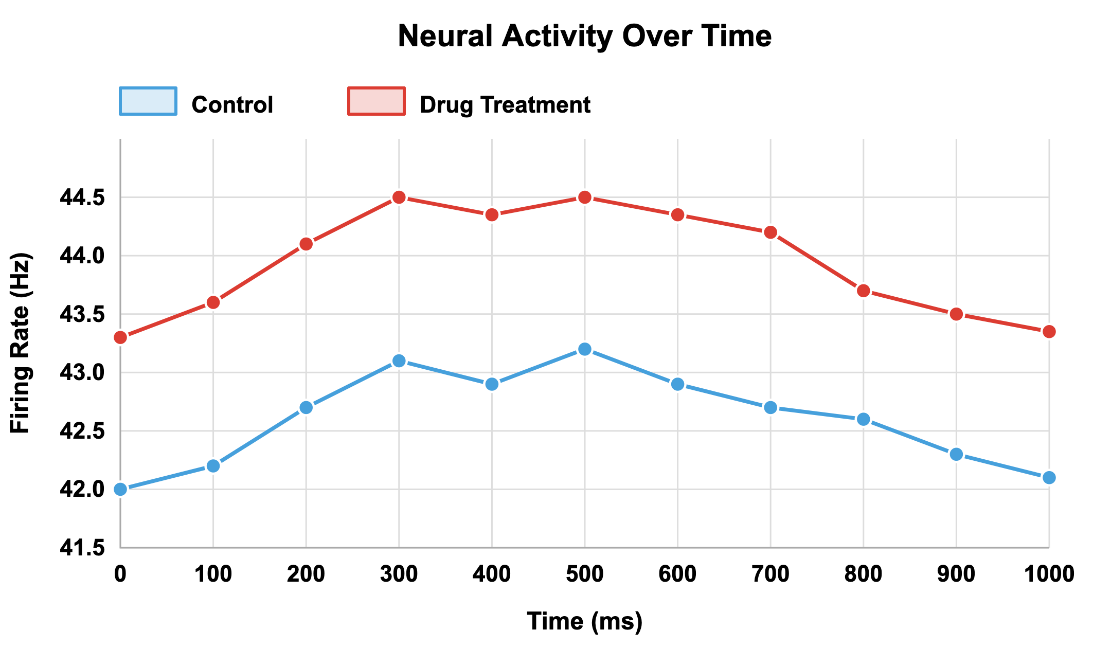
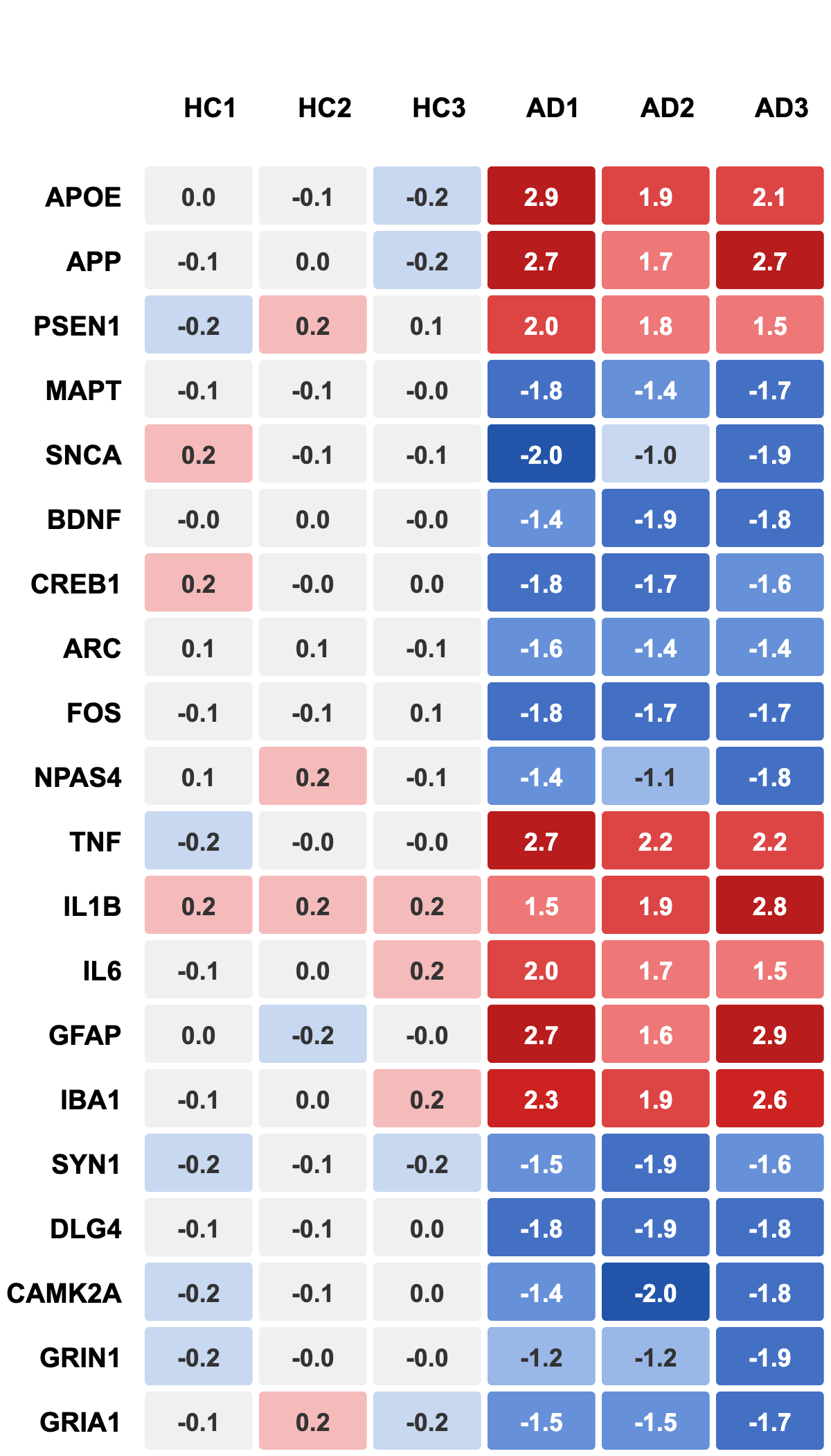
Consider a simple example: two plots showing the same experiment on neural firing rates in control versus drug-treated groups (note: we’ll return to this pair of figures in the activity for greater comparison).
Goal:
Develop a critical understanding of how to design and evaluate visualizations that communicate data accurately, transparently, and accessibly.
"Data visualization...reduces cognitive load, improves knowledge retention, and enhances learning."
In one version, the Y-axis begins at 41.5 Hz, making a small 2 Hz difference appear dramatic.

In the other, the Y-axis begins at zero, revealing that the difference is biologically minor.
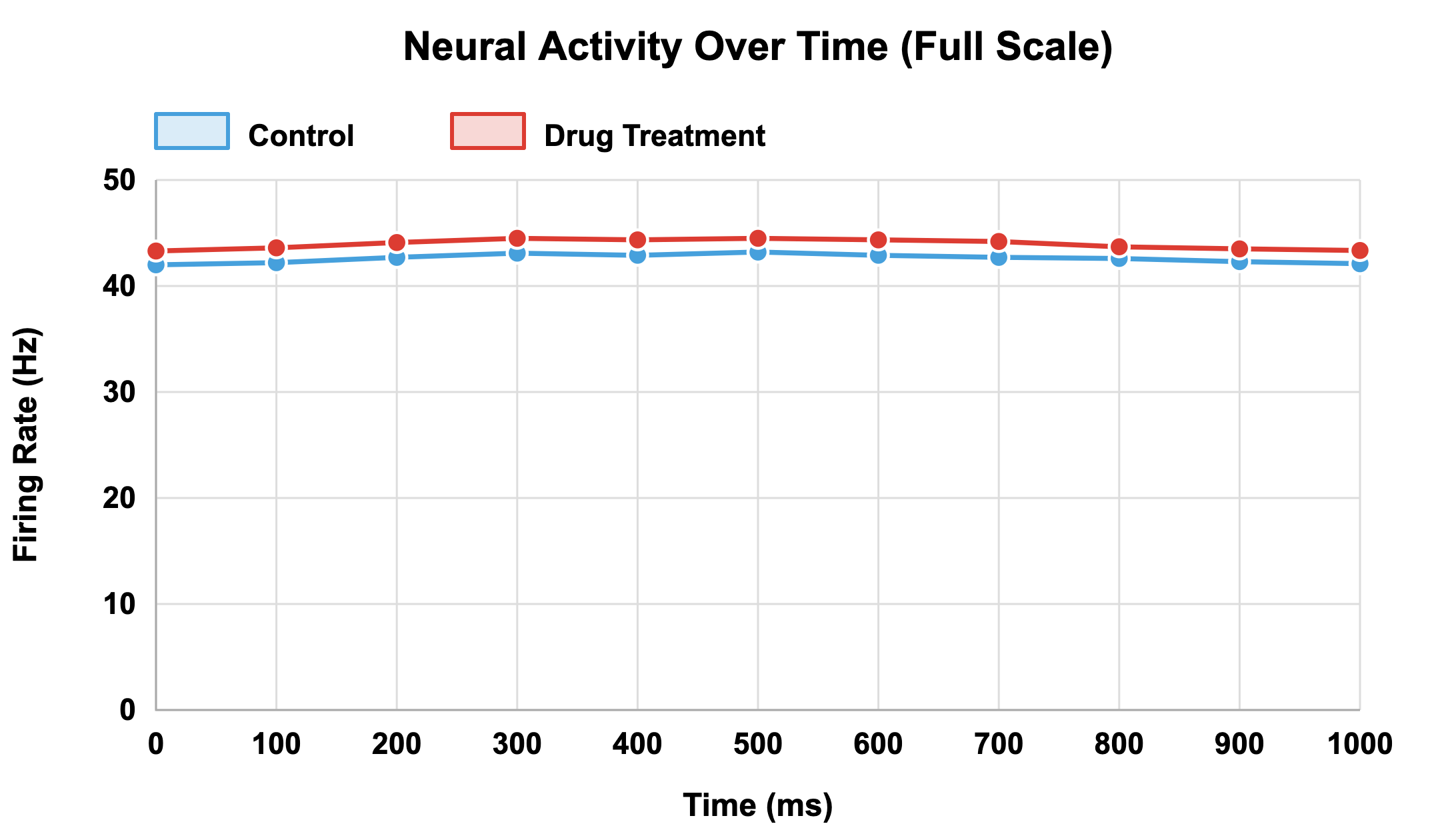
The underlying data are identical, yet the message is entirely different.
This example illustrates that communication clarity in visualization depends as much on design integrity as on data accuracy. A plot with incomplete context, even if numerically correct, can lead viewers to over-interpret effects or perceive false significance.
Evaluate your own figures to ensure that:
- There is a single takeaway from the figure.
- Someone unfamiliar with your dataset can interpret it correctly.
- The figure supports claims without exaggerating them.
- The chosen visual format is the right one to make your point as clearly as possible.
With great power comes great responsibility. Visualization choices about axes, colors, scales, and omissions shape how your audience perceives and remembers your results.
Clarity, honesty, and transparency should be the guiding principles. Rigorous visualization communicates the story of your data accurately and avoids leading viewers toward false conclusions.
1.2 Data visualization as a tool for discovery
While communication is often the first purpose that comes to mind, visualization is equally powerful for discovery. Before publication, plots and visual summaries help researchers explore datasets, detect errors, and uncover hidden relationships. In modern biomedical science, where genomics, imaging, and electrophysiology generate massive, multidimensional data streams, visualization is indispensable for making sense of complexity.
Humans are poor at spotting trends in raw numbers. Patterns that are invisible in tables become obvious when plotted. For instance, a long list of neuronal firing rates across trials tells little about behavior, but a raster plot can immediately reveal rhythmic bursts or stimulus-linked changes. Visualization turns data into insight.
The difference between exploratory and confirmatory visualizations
Exploratory visualization, used for hypothesis generation and pattern discovery, and confirmatory visualization, used to test specific hypotheses and communicate results, are fundamentally different modes of data visualization. Each has different goals and standards, and understanding this distinction is critical because the same visualization techniques may be appropriate in some contexts but not others. Not uncommonly, researchers use exploratory methods but present findings as if they were confirmatory (see HARKing). This can inflate false positives and causes major errors in reproducibility.
To best understand the distinction between exploratory and confirmatory visualizations when using data visualization for discovery, consider the function of each.
Exploratory visualizations are your discovery mode and are used when you first encounter your data and help you develop a hypothesis. Exploratory visualizations help answer important questions, such as:
- Are there patterns and relationships between various factors in my data?
- Do I detect outliers and data quality issues?
- What is the distribution and how do my data variables potentially impact each other?
- Have I made appropriate statistical assumptions in my data analysis plan?
As an example, imagine you have conducted a learning and memory behavioral study where rats learn to navigate a maze.
You have behavioral data, including number of trials to learning, errors made, time spent exploring and successful navigation occurred.
You also have counts of activated neurons from 15 different brain regions.
You begin exploring your data by creating:
- Bar charts showing average neuron counts in each region.
- Scatterplots of neuron activation compared to behavioral performance.
- Histograms of distribution of activation across animals.
- Heatmaps showing regions most active in successful vs unsuccessful learners.
While looking over your visualization, you notice that animals with higher activation in the hippocampus learned the maze in fewer trials. This is an exploratory discovery because you didn’t predict this specific brain region and behavior connection before analyzing your data. You found the relationship among all of the brain regions using data visualization as a tool.
Confirmatory visualizations are used to test specific, pre-determined hypotheses. This means you specified what you would visualize before seeing the data and you defined the analysis parameters in advance. This type of visualization demonstrates whether a predicated effect occurred, like in response to “We hypothesized that…” or “To test whether…”.
Building on the exploratory visualization use example above, after you detected the hippocampal activation, learning speed relationship, you design a further study. Your established hypothesis states that rats with higher hippocampal neuron activation will require fewer trials to reach successful learning performance in the maze. You define your analysis plan, including a scatterplot with regression lines, to visualize your data. After running your experiment, you create the pre-specified visualizations and find that they demonstrate support for a hypothesis that existed independently of this new experiment and cohort’s data.
Know the role of your data visualization, even in discovery mode. Exploratory visualizations will lead you to new conclusions and hypotheses; confirmatory visualizations will help you verify answers!
Liability in visualization-based data discovery
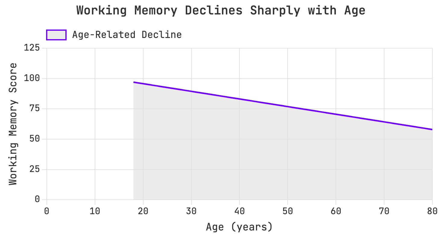
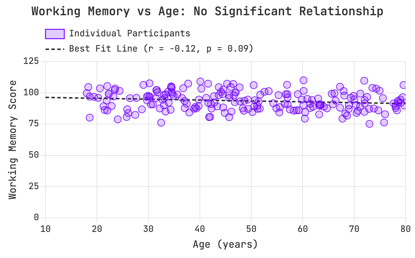
In discovery mode, however, visualization’s strengths can also become liabilities. The human brain is wired to detect patterns, even where none exist (See our unit on confirmation bias for more). Consider an example from cognitive research: a scatterplot of age versus working memory performance across 200 participants shows no significant correlation (r = -0.12, p = 0.09). But after smoothing and binning, the same dataset appears to reveal a sharp decline with age. The smoothing algorithm has imposed a pattern that isn’t real.
Aggressive smoothing creates a false age decline pattern:

Raw data reveals no measuring age-related performance relationship:

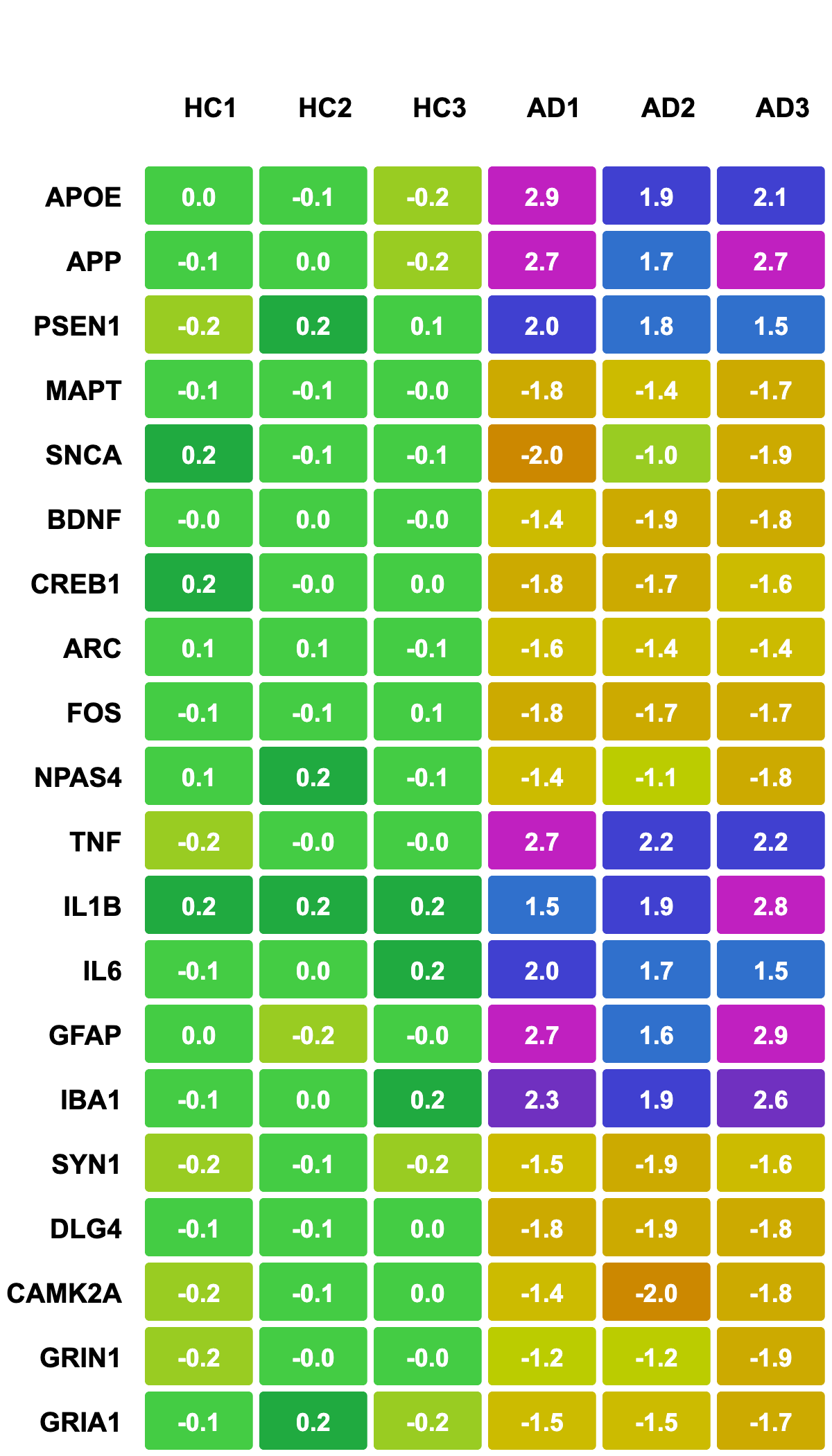
This problem is not unique to behavioral data. In genomics, for example, heatmaps with rainbow color scales can produce vivid visual differences where quantitative differences are minor. Small expression changes may appear large because our eyes perceive color gradients nonlinearly. When replaced with a perceptually uniform diverging scale (e.g., blue–white–red), the same data reveal balanced and biologically meaningful patterns.
Aggressive smoothing creates a false age decline pattern:

Visualization, therefore, both shows data and actively shapes perception of it. Seeing a pattern should not be considered proof, but integrated with statistical testing and biological relevance, can lead to real discoveries. Critical visualization literacy means asking whether a perceived pattern is real or an artifact of presentation.
The value of visualization for discovery depends on both plot choice AND viewer literacy. A heatmap, a scatterplot, and a UMAP projection may all summarize complex data, but each encodes information differently. For instance:
- Heatmaps reveal gradients and clusters in large matrices.
- Scatterplots expose relationships between variables.
- Dimensionality reduction plots (e.g., PCA or UMAP) show structure across thousands of features.
Choosing the wrong type of plot can lead to incorrect conclusions.
Raw data reveals no measuring age-related performance relationship:
Visualization aids discovery by revealing relationships in data, but these relationships must always be tested, not merely seen. Seeing a pattern is the beginning of inquiry not the end.
A donut chart used for dose-response data, for example, hides temporal progression:

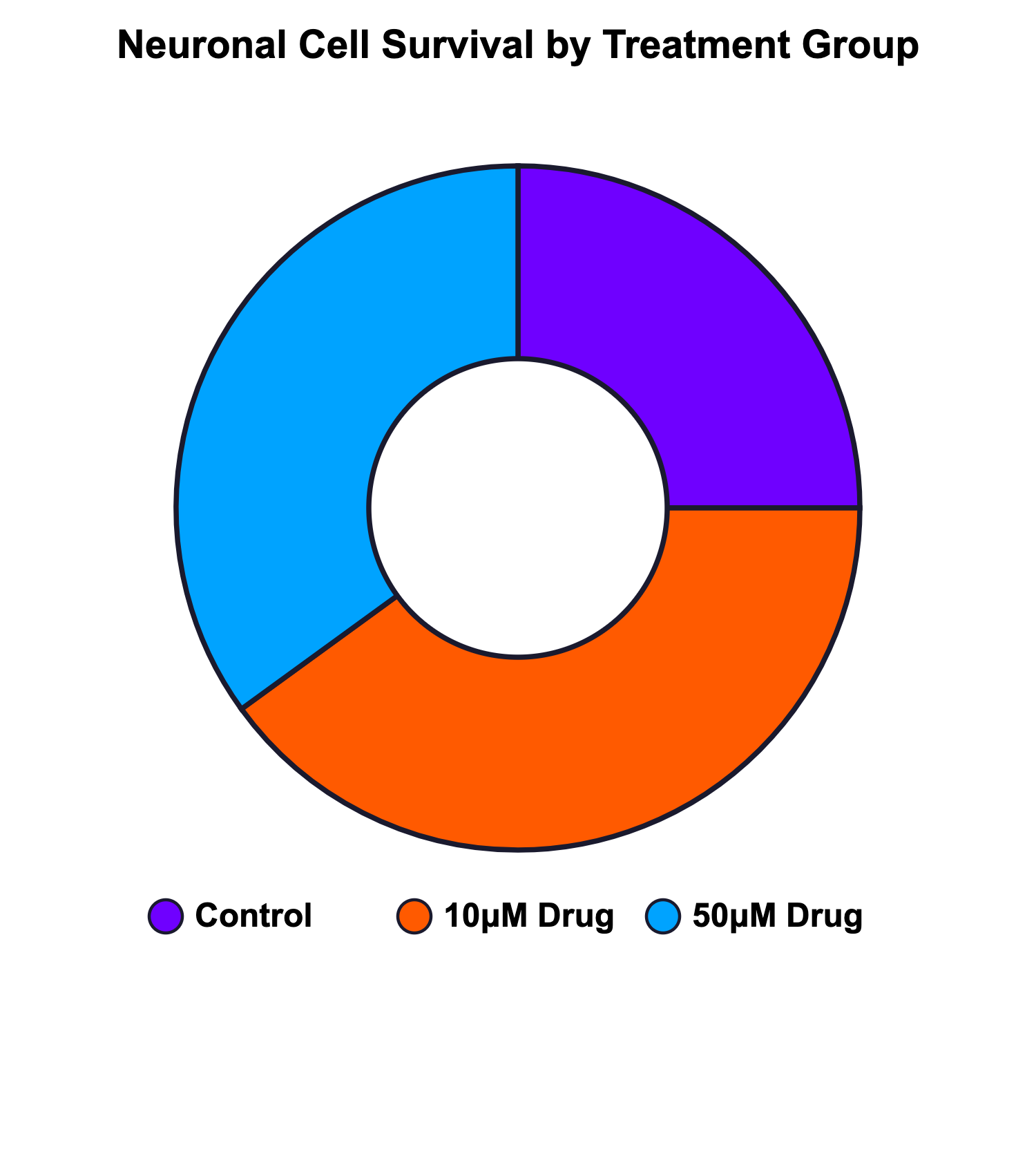
While a survival curve would make that obvious:

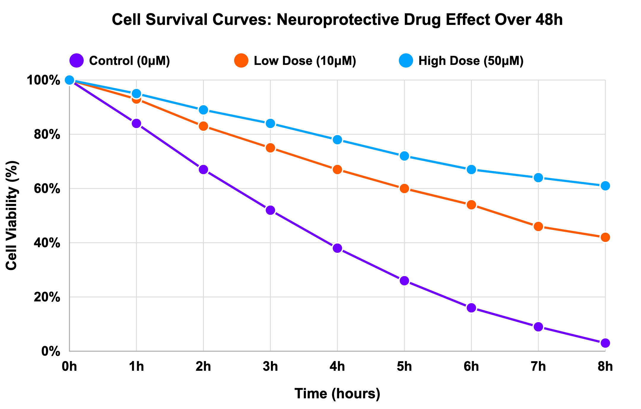
It is our responsibility as data visualization producers to account for viewer literacy. Acknowledging there is no way to have a complete understanding of our audience’s visual literacy, we must consider that more complicated figures come with increased opportunity for misunderstanding.
When data are complex, there’s a temptation to present all information in a single figure. But discovery often benefits from breaking data apart and showing subsets, individual points, or confidence intervals. Visual simplicity fosters real understanding.
Activity: Recognizing common visualization pitfalls
Let’s review some plots to identify visualization challenges.
Common pitfalls in data visualizations lead to ambiguity and misinterpretation. Find as many as you can!
Post-activity questions:
- How might you develop a sensibility for spotting these types of issues in your own work before publication? What pitfalls do you plan to look out for?
- Think about a figure you've recently created or seen in a paper from your field. What change(s) would you make to improve it?
Identifying common pitfalls in data visualization shows how plot choice might cause misinterpretation.
1.3 Common pitfalls and principles for rigor
Rigor in data visualization means designing figures that faithfully represent data and allow others to interpret them accurately. This section focuses on three major sources of error: misrepresentation, overload, and inaccessibility. Each can undermine the credibility of research if not carefully managed. Management starts at the inception of creating visualizations and requires intentional choices that link all the way back to experimental design.
Misrepresentation:
Misrepresentation can be intentional or accidental. It occurs when design choices (like chart type, scale, or selective inclusion) distort the data story. Misrepresentation can be mitigated through early, careful planning of data reporting during stages of experimental design. In neuroscience, truncating axes, excluding baseline periods, or plotting only “responsive” data points can all create the illusion of stronger effects.
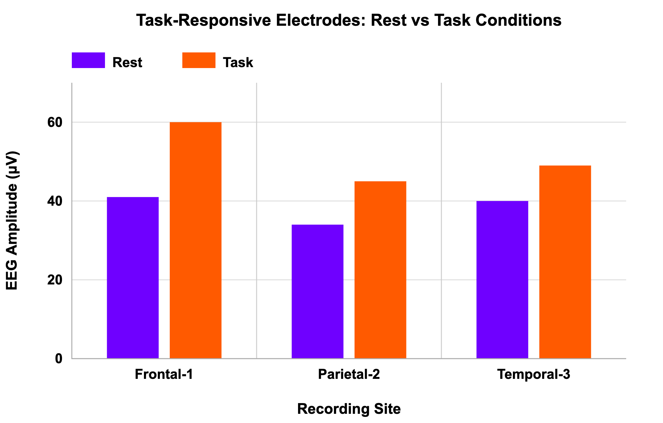
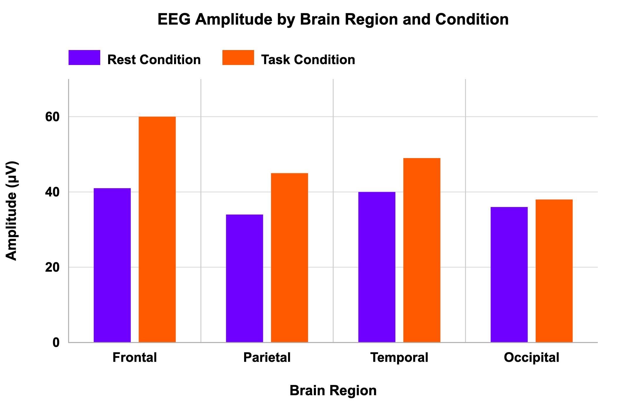
In a scenario of EEG amplitude measurement across different brain regions during rest vs. task conditions, a graph shows only the most active recording electrodes, omitting those that show no effect. This selection bias gives the impression that the treatment was universally effective, when in fact the full dataset would show large variability.
Professional presentation with selection bias:
Visual comparison reveals where patterns are present and absent:
Checklist for avoiding misrepresentation:
- Is your chart appropriate for the data type and statistical test?
- Can a viewer quickly determine what was being measured and compared?
- Are axes complete and clearly labeled?
- Are excluded or combined data points reported transparently?
- Is the language in titles and legends objective rather than persuasive?
- If a colleague unfamiliar with your experiment viewed the plot, would they interpret it the same way you do?
Rigor requires honesty in visual storytelling. An accurate visualization shows both what is interesting and what is true.
Overload and complexity:
Even accurate data can be obscured by clutter. Overloaded figures with too many variables, excessive color schemes, or confusing legends prevent comprehension.
For example, a researcher might attempt to show multiple experimental conditions, time points, and subgroups in a single chart. The result is an unreadable tangle of lines and colors, where trends are lost. Simplifying or separating figures can dramatically improve clarity.
Checklist for managing complexity:
- Who is your target audience, and what level of familiarity do they have?
- What is the single message this figure should convey?
- Can any element be removed without losing meaning?
- Are there too many categories or overlapping visual cues?
- Would a simpler or alternative visualization communicate the same idea more effectively?
Simplification is not an omission when done for comprehension. Omission of any data, for any reason, should be acknowledged in paired text.
Rigor is not about showing everything. Rather, it’s about showing the truth clearly.
Accessibility and transparency:
A rigorous figure must be accessible to diverse audiences. Accessibility has two dimensions:
- Conceptual accessibility: Can non-experts understand it?
- Visual accessibility: Can individuals with differing abilities (e.g., color vision deficiencies, low vision) interpret it?
Accessibility is driven by plot and design choices. Conceptual accessibility considerations include using jargon-free labels, providing context through annotations and labels, choosing appropriate chart types, including figure legends to explain symbols and scales, and even hierarchy of important information within a figure.
Visual accessibility includes using color-blind–friendly palettes, distinct shapes, and sufficient contrast ensures that meaning is conveyed through multiple cues, not color alone. For digital publications, providing alt-text or tabular data summaries helps screen reader users access the same information.
Checklist for accessibility:
- Are colors perceptually distinct and high-contrast?
- Are shapes or markers distinguishable without color?
- Could the figure be understood in grayscale?
- Does the figure include an alt-text description or accessible data table?
- Are figure titles and axis labels free of jargon?
Rigor and inclusivity are inseparable. A figure that some readers cannot interpret correctly is, by definition, not rigorous.
1.4 Our responsibilities when producing data visualizations
As the producer of a visualization, you are the first audience for your data and the final arbiter of how it is shared. The rigor of your work depends not only on statistical correctness but also on how transparently you communicate findings. Every choice from chart type to color palette affects interpretation.
When you create a figure, ask yourself:
- Does this visualization accurately reflect the evidence?
- Have I unintentionally exaggerated or minimized effects?
- Can another researcher reproduce this figure from my data and reach the same conclusion?
In other words, rigor begins the moment you decide to put data into image form. Visualization is not an afterthought, it is part of the scientific method.
You are both storyteller and gatekeeper. Each decision you make when designing a figure shapes how others will understand and build upon your data.
Takeaways:
- Visualization is essential for both scientific communication and discovery.
- Poor visualization can mislead, obscuring the real meaning of data or creating false impressions.
- Rigorous visualization emphasizes clarity, transparency, and accessibility.
- Design choices matter: scales, colors, and selection all influence interpretation.
- Clarity and honesty should guide every figure. Simplify without distorting; highlight without exaggerating.
- Accessibility is rigor: ensure that all audiences, regardless of background or ability, can interpret your data.
- Visualization literacy (understanding how and why visualizations communicate) is as crucial to good science as statistics or experimental design.
Reflection:
- What patterns have you “discovered” in your data through visualization?
- How can you verify that those patterns are genuine and not products of scale or smoothing?
- Do your visualization choices allow others to trace your reasoning and reproduce your findings?
- Recall a recent figure you made for a presentation or paper. How might your visualization choices have influenced how others interpreted the data?
- If you revisited that figure today, what changes could you make to improve its clarity, transparency, or accessibility?
Lesson 2:
Data structures and visualizations
Summary
This lesson explores how the structure of data (its distribution, pairing, and variability) determines how it should be visualized. Choosing a plot incongruent with expectations of data structure can obscure real findings or create the illusion of effects that do not exist. By contrast, when visualization aligns with data structure, the figure accurately communicates uncertainty, spread, and within-subject relationships. Through examples, learners will examine how plot choice interacts with statistical assumptions and how to select figures that reveal, rather than distort, the truth within data.
2.1 Why structure matters
Every dataset has a structure defined by how observations are distributed and related. Some datasets are normally distributed, clustering symmetrically around a mean. Others have skewed distribution or contain outliers that stretch the tails. Some study designs are paired, meaning measurements are taken from the same subjects or from matched units, so analyses often focus on differences within each pair. Others are unpaired, comparing independent groups. Pairing is most useful when measurements within a pair are correlated, and less useful when measurement error dominates.
Each of these features carries implications for both statistical analysis and visual representation. A t-test, for instance, assumes normal distribution and independence. A bar plot showing mean ± standard error makes the same assumption visually: it depicts a single central value with symmetrical uncertainty. But when the data violate these assumptions, say, because of skew or outliers, the picture it paints can be misleading.
Data visualization, then, encodes statistical logic. The wrong plot can imply false precision or hide variability; the right one helps viewers grasp the underlying data structure at a glance.
Goal:
Develop the ability to recognize how data structure influences visualization choice, and to select plots that faithfully represent variability, distribution, and paired relationships in scientific data.
A visualization is an assumption about your data’s structure. When that assumption is wrong, the figure misleads even if the numbers are correct.
Activity: How plot choice reveals data structure
Let’s explore two scenarios to discover what visualizations imply about data structures.
Select a plot that reflects the data!
Post-activity questions:
- Have you ever been surprised by the data after you first reviewed figures in a study? How were your expectations defied?
- How have you thought about data structure in regards to data visualization in the past?
- Are there additional ways of visualizing the data based on the given structure that could be useful? How so?
Data structure should help you identify the most appropriate choice, that works with plot choice expectations, and lead people to see relationships correctly.
Let’s review what we saw in the activity in more detail.
Example 1: Outliers and bar graphs:
We have a study testing whether a mutation affects walking speed. The data are collected, analyzed, and presented as a simple bar graph showing the average speed for wild-type vs. mutant groups with standard error bars.
Average speed for wild-type vs. mutant groups with standard error bars:

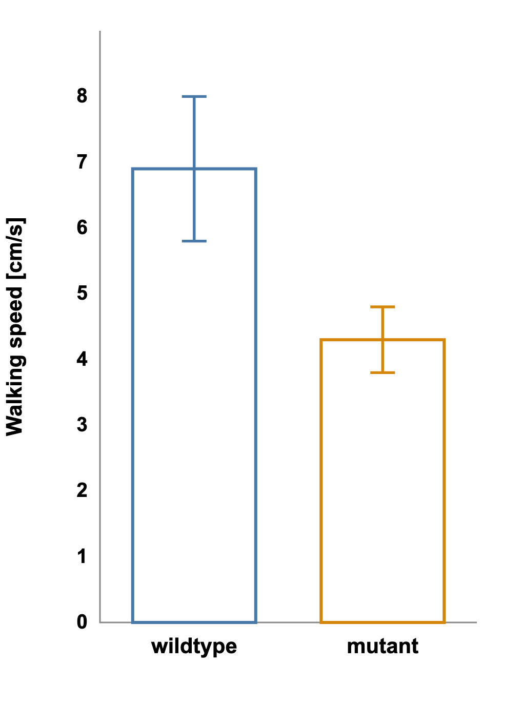
The bars do not overlap, and the result looks promising, perhaps even statistically significant.
Yet when the same dataset is shown as a boxplot displaying the median and full range, a different story emerges. The plot of the mutant group has long whiskers and several extreme outliers.
Plot of the mutant group with long whiskers and several extreme outliers:

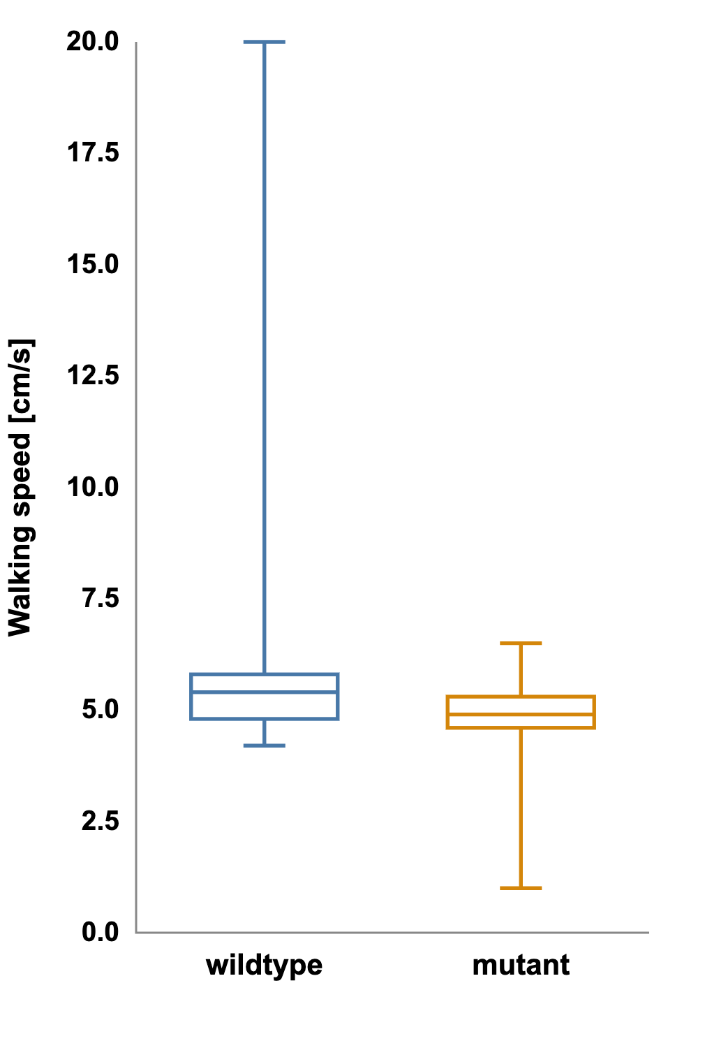
What appeared to be a clean mean difference is actually driven by a few unusually slow individuals.
The assumption of normal distribution, shared by both the bar graph and the t-test, was false. A non-parametric test such as the Mann-Whitney U confirms the suspicion: p = 0.18.
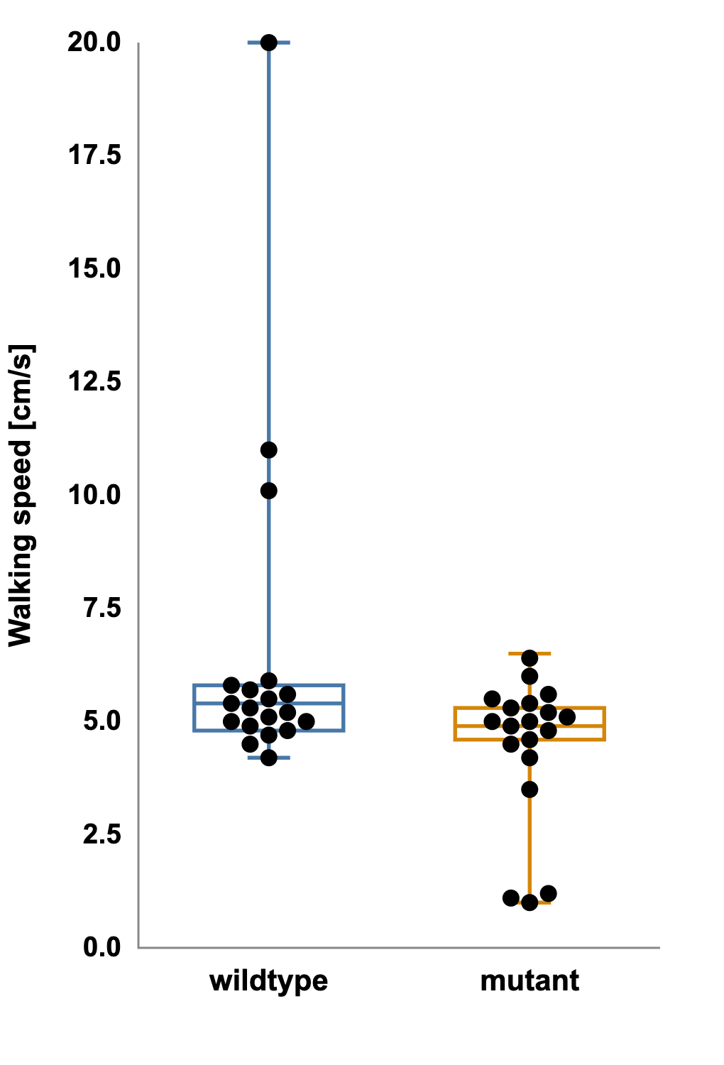
The effect that once looked significant is gone.
This example underscores a central lesson: a figure can be statistically incorrect if its design implies assumptions that the data do not meet.
Boxplots reveal distributional information that bar graphs hide:
- The whiskers mark the minimum and maximum within a defined range.
- The box captures the middle 50 percent of data.
- The line inside the box marks the median, a measure robust to outliers.
Because the boxplot encodes spread, asymmetry, and outliers, it allows viewers to judge whether the data are likely normal and whether reported differences are meaningful.
Bar graphs show the mean; boxplots show the story.
When assessing distribution, ask:
- Does the dataset appear symmetrical or skewed?
- Are there extreme values that could distort a mean?
- Would a boxplot or violin plot better represent the variability?
- What assumptions does this statistical test make, and does the figure convey those same assumptions accurately?
2.2 Visualizing relationships: paired vs unpaired
Another structural feature that determines plot choice is pairing. Paired data arise when measurements are taken on the same subject under different conditions like before and after treatment, left vs. right hemisphere, pre- and post-training session. In these cases, each data point has a natural partner, and the question of interest is whether each individual changed.
Aggregating paired data into two independent groups erases this relationship. The overall spread might look large, suggesting high variability, even when every subject changes in the same direction.
Let’s review what we saw in the second scenario of the activity in more detail.
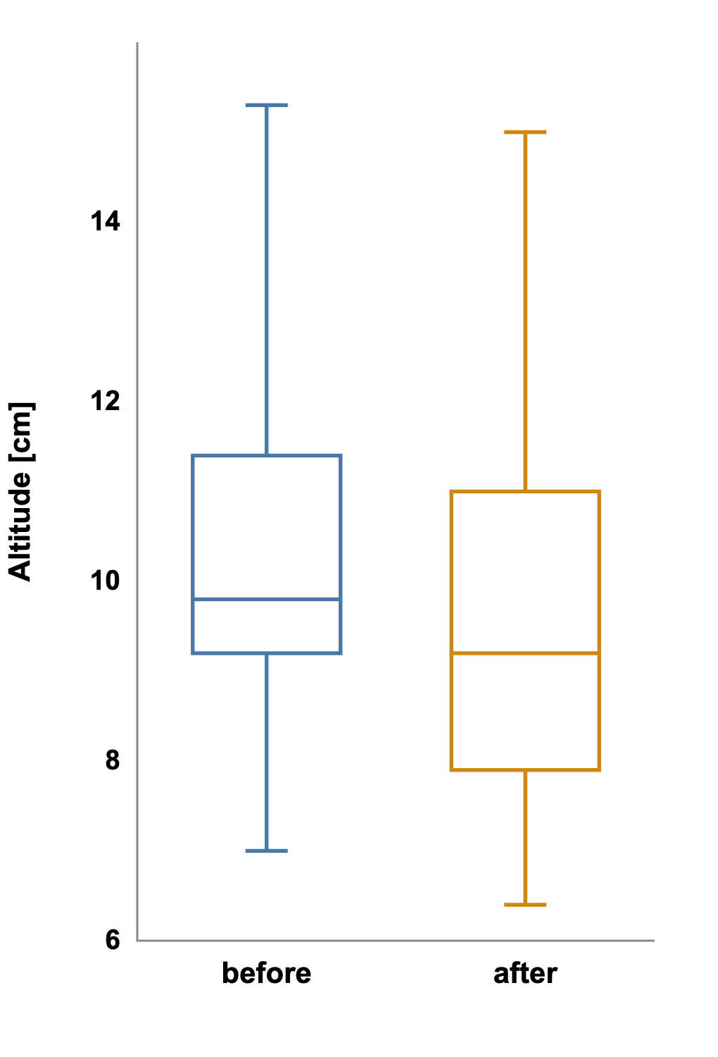
Example 2: Revealing the Paired Effect
After the walking-speed experiment, you test a drug that might increase jump height. You measure each animal before and after treatment. Initially, you visualize the results as two independent boxplots: pre-drug vs. post-drug. The boxes overlap substantially, suggesting that there is no difference between the groups. A Mann-Whitney U test agrees: p = 0.40.
But when you plot each subject’s paired values and connect them with lines, the pattern changes.

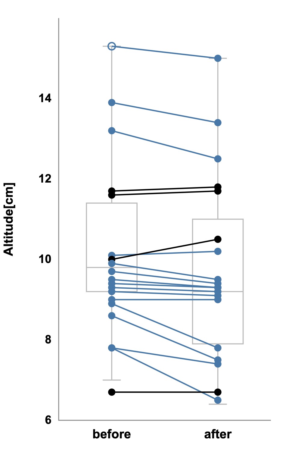
Nearly every line slopes upward, showing each animal jumped higher after treatment. The within-subject consistency, hidden before, now leaps off the page.
The appropriate analysis is a paired-sample test such as Wilcoxon that shows p < 0.01, confirming that the visual impression is correct. The data didn’t change; the perspective did.
In paired designs, showing individual trajectories often reveals real effects that group summaries conceal.
When choosing the correct perspective, ask:
- Are the groups composed of independent samples or repeated measures?
- Could individual lines or matched symbols clarify within-subject trends?
- Does the plot highlight what the analysis actually tests?
However, be careful when assuming paired data and evaluate whether under your conditions and for your model, variability across individuals dominates variability across times of measurement, days in between measurements, etc.
2.3 Choosing the right plot for the right data
Good visualization aligns three elements: the data structure, the statistical test, and the visual representation. When these are congruent, the figure communicates clearly and reliably.
Below are some overall guidelines for expected use cases for common plot types. These are not meant to limit your choices, but to help orient you to the expectations around how figures are used.
When to use bar graphs:
- Data are approximately normal and have similar variances.
- The sample size is moderate to large.
- The main message concerns the average value rather than distribution.
- Error bars depict standard error or confidence intervals transparently.
Bar graphs are compact and intuitive, but they hide information about variability. Never use a bar graph without error bars, and avoid them for small or skewed datasets.
When to use boxplots or violin plots:
- Data may be skewed, contain outliers, or come from small samples.
- You want to emphasize spread and median rather than mean.
- The audience benefits from seeing distribution shape.
Boxplots promote transparency by revealing the entire range of data, not just its center. Violin plots extend this further by visualizing the full density.
When to use paired-line or dot plots:
- Each data point has a matched partner.
- The question centers on change within individuals.
- You want to visualize both direction and consistency of effects.
Connecting paired data with lines transforms abstract statistics into visible trajectories. Even without p-values, patterns become self-evident.
The most rigorous figure is the one that makes statistical results intuitive before a single number is read.
2.4 Visual pitfalls and how to avoid them
Even experienced researchers fall into predictable traps when visualizing data. These pitfalls rarely stem from carelessness. Rather, they arise from habits, software defaults, or the desire to make results look “clean.” Recognizing them early helps ensure your figures remain faithful to the data they represent.
Below are some of the most common visualization missteps and how to avoid them.
Averages without context: Averages conceal variability. Two groups can have identical means but completely different spreads. Always accompany means with error bars or distribution indicators.
Pie charts for continuous data: Pie charts convey proportions of a whole, not measured variables and even that they do poorly. They are poor choices for datasets with continuous values or overlapping categories. Replace them with bar charts or boxplots to show comparisons more accurately.
Ignoring outliers: Removing or ignoring outliers without documentation undermines transparency. If extreme values must be excluded, explain why and visualize their influence. Outliers often hold valuable clues about biological variability.
Mismatched statistics and plots: If your figure implies a normal distribution but your analysis used a non-parametric test, the mismatch confuses readers. Visual design should mirror analytical assumptions.
Over-summarization: Aggregating data can hide important nuances. Consider showing both summary statistics and raw data points, like “beeswarm” or jitter plots, so audiences can judge patterns for themselves.
Clarity in visualization means showing enough data for others to see what you saw.
Even small visualization errors can erode trust in scientific findings. By being alert to these pitfalls and correcting them early, researchers reinforce the transparency and interpretive rigor that make data visualization a cornerstone of credible science.
2.5 Linking visualization and statistical thinking
In rigorous research, visualization and statistical analysis are not separate steps. They are two sides of the same reasoning process. The way you plot data should emerge naturally from how you collected it and what question you are trying to answer.
Before creating a figure, take a moment to think through the logic of your dataset. What kind of variable are you working with: continuous, categorical, or a proportion? Are your samples independent, or are they paired measurements from the same individuals? Are your values distributed symmetrically or with noticeable skew and outliers? And finally, what question is your analysis really asking: a difference in averages, a difference in medians, or a consistent change within individuals?
Each of these considerations points toward a specific statistical test and a visualization that communicates its results accurately. When the analysis and the plot type match, the figure feels intuitive and credible; when they diverge, the viewer is left uncertain about what is being shown.
For example, when data are normally distributed and independent, a t-test and a simple bar graph with error bars convey the main result clearly. But when distributions are skewed or contain outliers, a boxplot with the raw data points overlaid gives a truer picture and supports a non-parametric test like the Mann–Whitney U. Paired data, by contrast, call for a visualization that highlights within-subject changes, such as a paired-line plot or a dot plot connecting pre- and post-values, paired with a Wilcoxon or paired t-test.
The table below summarizes these relationships:
|
Data structure |
Typical test |
Recommended plot |
|---|---|---|
|
Normal, unpaired (independent) |
t-test |
Bar graph with error bars |
|
Non-normal (skewed or contain outliers), unpaired |
Mann–Whitney U test |
Boxplot with raw data overlay |
|
Normal, paired |
Paired t-test |
Paired-line plot with mean ± SE |
|
Non-normal, paired |
Wilcoxon signed rank test |
Paired-line or dot plot showing medians |
When the elements of data structure, test, and visualization align, the result signals methodological rigor. A figure that communicates how data were analyzed allows others to evaluate and reproduce your reasoning.
2.6 Why this matters for neuroscientists
Spanning cells, circuits, and behavior, neuroscience data are notoriously noisy, variable, and hierarchical. These complexities amplify the consequences of poor visualization. A truncated scale or hidden pairing can make an insignificant neural response look groundbreaking or mask subtle but real changes across trials.
For example, representing neural firing rates with mean ± SE might imply precision that does not exist, especially when variability between cells is large. Displaying the same data as individual points or boxplots reveals the heterogeneity inherent in biological systems.
Transparent visualization practices not only strengthen your conclusions but also protect others from building on misleading findings. Rigor in plotting is, therefore, as essential as rigor in experimental design or statistical analysis.
A figure that tells the truth, even when the truth is messy, is an invaluable contribution to scientific rigor.
Takeaways:
- Data structure determines visualization. Always align figure type with distribution and design.
- Bar graphs are suitable for normal, unpaired data; boxplots for non-normal or outlier-rich data.
- Paired designs demand plots that emphasize within-subject change.
- Plot choice and statistical analysis must agree.
- Transparency (showing distribution, outliers, and pairing) promotes rigor and reproducibility.
- Visualization is analytical reasoning made visible.
Reflection:
- Think about your most recent figure. Did its visual form match the assumptions of your analysis?
- Could someone unfamiliar with your study infer, just by looking, whether your data were paired or independent, normal or skewed?